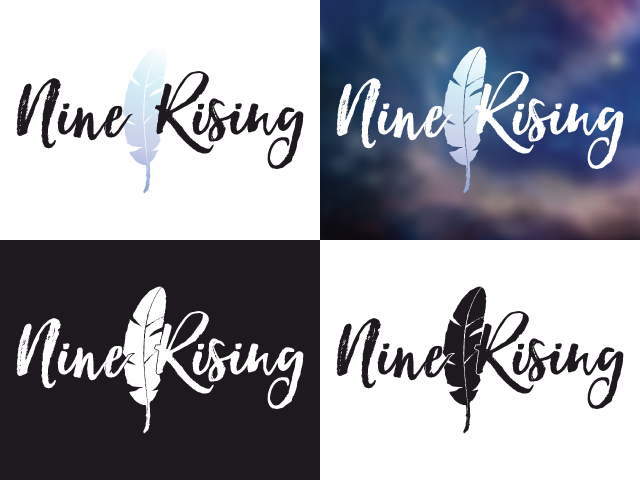
Logo for an all gender empowering organization.
While working with the company/organization that was working on eKanary, the owner wanted to rebrand from 4thegirl to something else. Though it took some time to narrow down on what was desired, the results was Nine Rising, featuring shades of blues and purples from the previous brand and a feather.
The company has since then had a rebrand again, but this was a favourite of mine. I enjoyed the watercolour vectoring that led to the ring of colours and making the feather.
The company has since then had a rebrand again, but this was a favourite of mine. I enjoyed the watercolour vectoring that led to the ring of colours and making the feather.
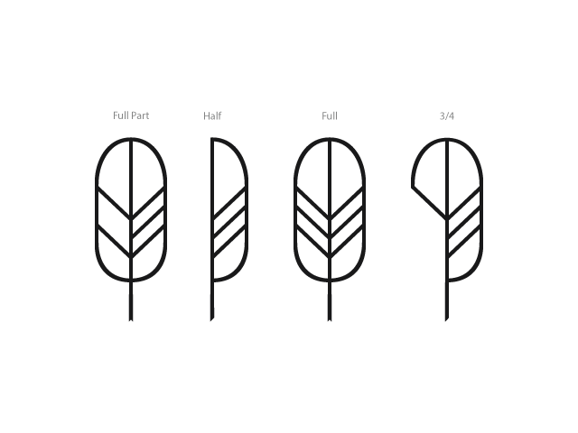
Here was the feather used in the first attempt. I wanted to make it asymmetrical and allow the font to fit.
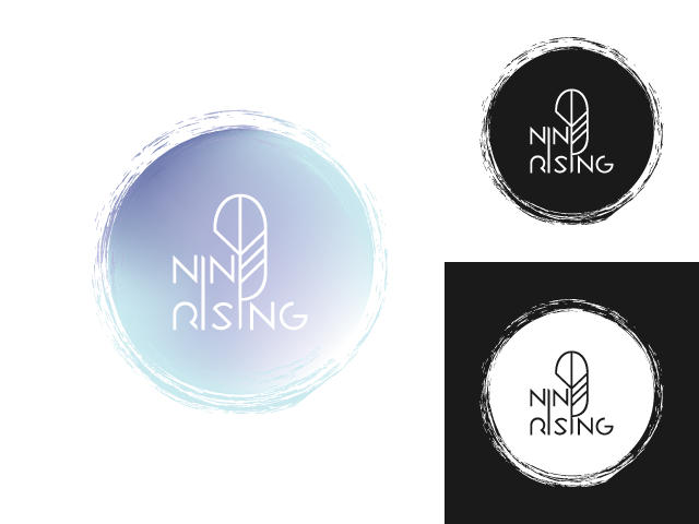
I tried this more clean cut and modern looking logo, making the font's lines and angles match exact to the feather. The tip of the feather's bottom even match the tip of some of the letters. Although the feather was cute, it didn't quite feel right. I worked on the circle for awhile, giving the edge a brush texture look and making the colours like watercolours. Overall it was a neat look, but we moved to something else.
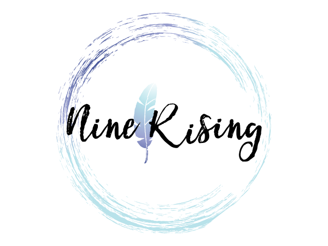
The circle was a combination of a ring and a filled circle. I removed the central piece I worked on and kept to the ring. After awhile of choosing fonts, we narrowed down to this one.
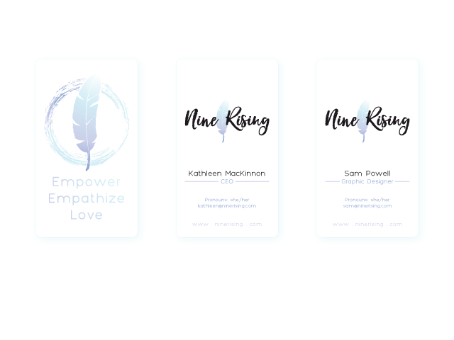
I didn't get cards myself, as this was made before I had to depart, but it was included in the following mockup for the CEO's business cards. This was only one of a few options that had very minor tweaks.

I had to define an empty space around the feather, for whenever it was placed over the ring. I made sure it was the same texture as the feather itself and took that out of the ring in one version.